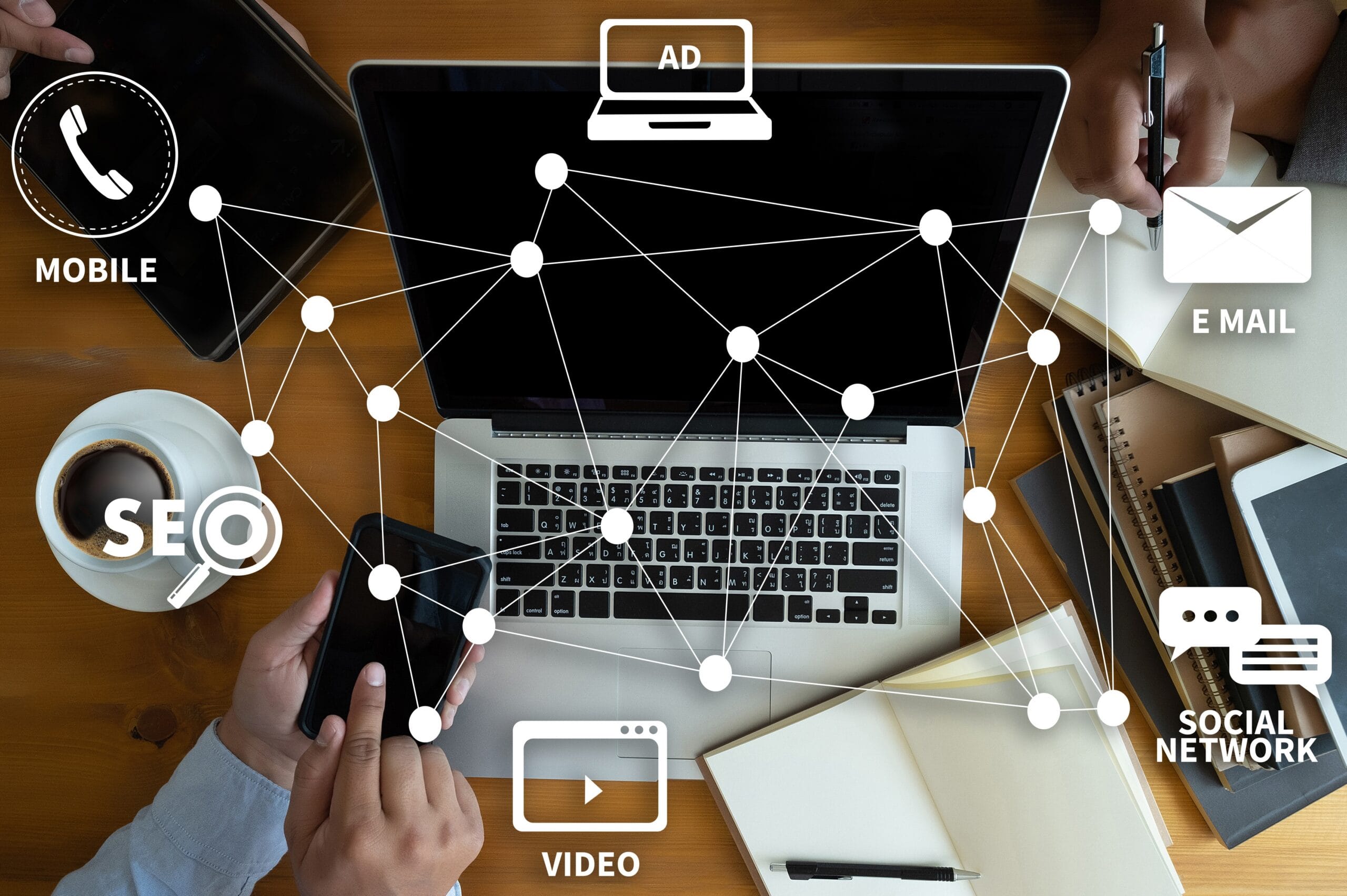
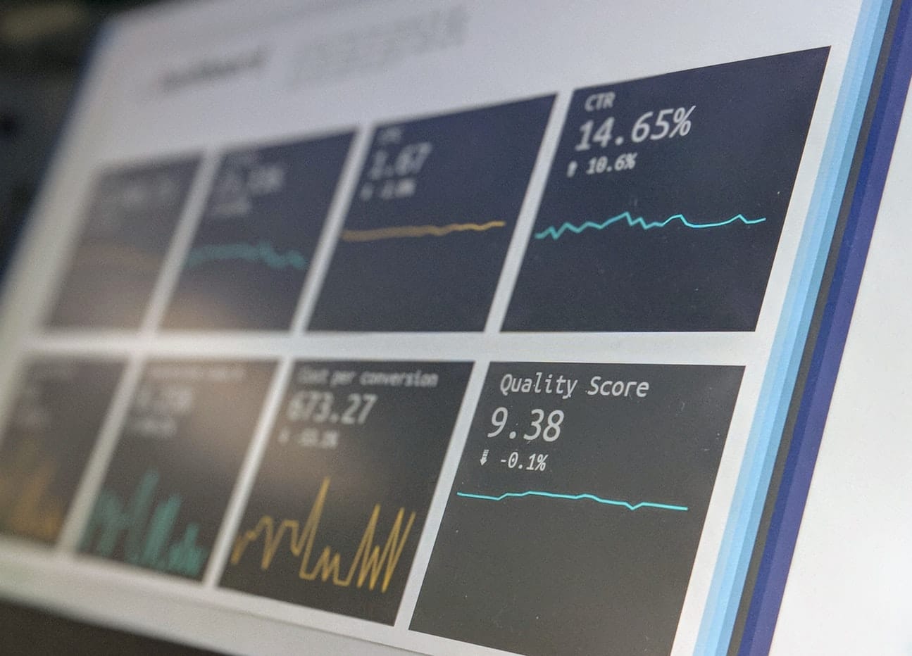
Landing page optimization is the process of creating a well-designed page for pay-per-click campaign (PPC) visitors by optimizing each element on the page to maximize the percentage of visitors that complete your desired goal.
That sounds complicated, but it’s basically just creating a page on your website designed in a strategic way to get users to convert on one main desired action – and in turn, raise the ROI of your PPC marketing campaigns.
The ultimate goal of conversion-optimized landing pages is to build pages that better engage your target audience so you can drive more leads and raise the ROI of your PPC marketing campaigns.
Landing page optimization is essential for successful campaigns, and there is no “one size fits all” approach, unfortunately (although, that would make our jobs a lot easier).
Let’s talk about the ways you can optimize your landing pages for conversions.
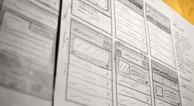
1. The 5-Second Usability Test
Your eyes are your best free auditing tool, and it only takes five seconds to prioritize what’s important.
The 5-Second Usability Test is a method of user research that helps you measure what information users take away and what impression they get within the first five seconds of looking at a landing page. Is the landing page effectively communicating its intended message?
There are three questions that you need to be able to answer within five seconds:
- Who are you (the business)?
- What product/service do you provide?
- What’s in it for me (the customer)?
If your landing page does not address these questions, you are basically throwing money in the trashcan.
2. Decrease Distractions
The ideal ratio between the number of things you can do on a given page to the number of things you want people to do is 1:1.
The only action people should be able to take on your landing page is the one action you want them to do, i.e., downloading a whitepaper, requesting a free demo of your software, or scheduling a free consultation. The more distractions you have (i.e., links, buttons, or offers) are merely a distraction that could (and will) keep them from converting.
Clean, clutter-free design always wins. Make use of white space so that the eye can smoothly flow from one element to the next without getting stuck or confused.
Visitors will be able to grasp the message you’re trying to give them more easily and hopefully interact with the page in the way you want.
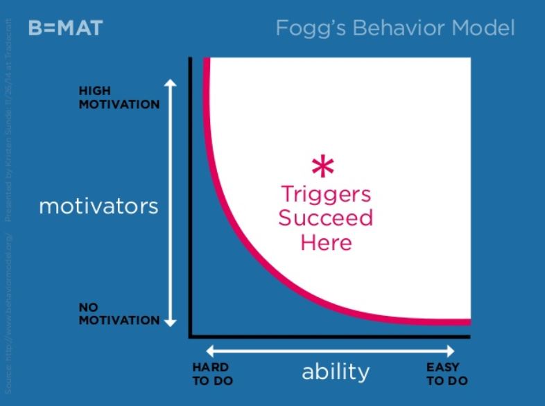
3. Design for Motivation First, Then for Ability
Landing page design isn’t as easy as simply choosing a bright, contrasting color for your buttons or adding a form above the fold. While those are both proven, solid tactics, there’s a lot more to it than that. Enter the Fogg Behavior Model.
The Fogg Behavior Model states that there are essentially two ways to increase conversions:
- Increase motivation
- Increase ability
Behavior = Motivation + Ability + Trigger (B = MAT)
But how do you do that?
One tactic for increasing motivation is to create urgency and scarcity.
We’ve all seen ads that say “while supplies last” or “deal ends soon.” One example would be to implement a countdown timer.
If a potential customer thinks they’re going to miss out on a good deal, they’re more likely to purchase.
Increasing ability is traditionally the main point of focus for designers when it comes to landing page design. A designer’s job is to make the action of converting seem as easy as possible for the end user. This is where clean, clutter-free design that masters white space is key.
You want to aim for the top right — high motivation, easy to do, and a trigger (call to action button) in place. If you have high motivation and low ability (difficult to do), all you’ll get is frustration.
If it’s low motivation, but easy to do — like taking out the trash — you get annoyance.
Determine what motivates your target customers
What is driving your customers? What are they looking for? What do you think they’re coming to your landing page for?
There are three types of motivation:
- Sensation: Seeking pleasure, avoiding pain – i.e., looking for a doctor for back pain
- Anticipation: hope/fear – i.e., looking for insurance
- Social Belonging: belonging/rejection – i.e., don’t buy this or else everyone will hate you or buy this, and you’ll be cool
Say you are building a landing page for a chiropractor. The people coming to the website are going to be on the higher end of motivation because they’re likely in enough pain that it’s made them decide to research for help.
Target your messaging around that pain point and finding relief. For example: Don’t let your pain slow you down anymore.
Maybe they aren’t 100% motivated, and they’re shopping around, so display an offer that will increase motivation and entice them to convert.
The calls to action (CTAs) and triggers should be about how easy it is to do or what they get out of it if they convert.
If they are highly motivated, you can get away with CTAs further down the page. If their motivation is lower, then you need to have compelling language or an incentive that increases their motivation.
4. Create Calls to Value vs. Calls to Action
You know a typical call to action is usually “Get Started Today” or “Sign Up.”
They’re asking to you take action, but they aren’t giving anything else. They aren’t offering you any value or telling you what will happen when you give away your information.
Try attaching a value proposition to your call to action. For example, “Start Saving Today” gives the customer the added value of possibly saving money if they sign up for your service.
Adding a personalized “why” to the desired action will make the offer more appealing, and they’ll be more likely to click.
5. Add Social Proof and Build Trust
The people landing on your page might not know you at all. Maybe they’ve never heard of you.
Why should they trust you?
Adding social proof to your landing page will improve your credibility, and potential customers will feel more comfortable trading their information for whatever offer you’re promoting.
Here are some ways to include social proof on your landing page:
- Testimonials from past customers
- Awards won
- Publications in which you’ve been featured
- Warranties
- Satisfaction guarantees
- Competitor comparison
- Certifications
Anything you can do to say “See? Other people like and trust us, so you have nothing to fear” will only work in your favor.
6. Answer Users’ Questions BeforeThey Think of Them
They’re on the landing page and considering the offer. But they (naturally) have questions.
Your landing page needs to answer them before the user thinks of them. Consider what new people might ask about your product or service, and then answer it on the page.
Some common questions to consider:
- What if I don’t like the product (is there a refund policy)?
- What payment methods are accepted?
- Is this product trustworthy? Who else uses it?
- When will I receive this product?
- How much does it cost?
7. Optimize the Landing Page With the User in Mind
Keep the user in mind at all times when you are designing and writing your landing page. What is motivating them? What should you use to drive them toward your CTA?
Optimize for their motivation, and you’ll end up asking yourself the right questions and answering your customers’ questions before they think of them.
Not every digital marketer or entrepreneur asks themselves these questions, but the ones that do are smashing the competition.
Digital Strike
Learn more about Digital Strike